Ever stared at those Agreeable Gray walls—the ones you swore would finally make your space feel grown-up, stylish, pulled-together—and still felt like something was off? Like the bones were good, but the soul was missing? Yeah, I’ve been there, pacing my tiny Texas kitchen at 2 a.m., wondering if I messed it all up or if I just hadn’t found the right cabinet color to make it sing. Because that’s the real kicker: the wrong cabinets can kill the vibe faster than a busted AC in a Houston July. But nail it? You’ll walk in every day feeling a jolt of pride, like you just won the damn lottery.
Years back, I painted my walls Agreeable Gray, thinking it would fix everything. But my builder-grade honey oak cabinets clashed so bad, it looked like a fight broke out between 1994 and 2025. I spent months stalking Pinterest, grilling paint guys at Home Depot, and even crashing open houses pretending I was a serious buyer—all chasing that combo that felt right. I swore I wouldn’t stop ‘til I cracked it, and what I found was a mix of hard-won tricks, gut calls, and a few “oh hell no, never again” disasters.
This guide? It’s me handing you my battle-tested playbook—the colors that actually work, why they click with Agreeable Gray, and how to dodge the landmines I stomped on. We’ll break down the real talk from the shiny magazine lies, sneak in some fresh 2025 trends, and dive deep into what folks like us—the ones sweating through remodels on a real-world budget—need to know. Because whether you’re fighting that Seattle gloom or chasing sun in Phoenix, I promise, by the end of this, you’ll see your dream kitchen not as a someday fantasy but as a map you can follow, step by gritty step. So, what’s the one thing you’re scared to screw up? Let’s tackle it, right now.
Why Agreeable Gray Is the New Classic (And Why It Messes with So Many Cabinets)
Agreeable Gray walks that tightrope between warm and cool—a shapeshifter that looks soft beige in morning light but flips cool gray by night. That’s what makes it a 2025 favorite from coast to coast, whether you’re sweating through Florida summers or dodging Midwest blizzards. But here’s the rub: its subtle undertones can clash hard with the wrong cabinet color, turning your carefully planned reno into a patchwork mess faster than you can say “return policy.” I learned this the hard way when my old espresso cabinets turned my Agreeable Gray into a muddy swamp—made my kitchen look like it was stuck in a rainstorm that never ended.
So how do you avoid that trap? First, recognize that Agreeable Gray has a warm greige base with sneaky hints of green and taupe. It plays nice with colors that lean warm, muted, or earthy—but throws shade (literally) at super cool blues or stark whites. The trick is picking cabinet colors that highlight its warmth without dragging it down. Here’s a cheat sheet I wish someone handed me:
| Cabinet Color Type | Why It Works (or Doesn’t) | Undertone Compatibility |
|---|---|---|
| Warm Whites | Amplify Agreeable Gray’s cozy vibe | Yes |
| Cool Whites | Can clash, making walls look dingy | No |
| Greiges & Taupes | Blend seamlessly, create harmony | Yes |
| Blue-Greens | Risky, may turn walls muddy | No |
| Deep Charcoals | Add drama without fighting undertones | Yes |
Remember my mistake? I went dark brown, hoping for contrast, but the warmth was all wrong—it looked like I dipped my walls in mud. Instead, think softer taupes or creamy off-whites. So before you pick, ask yourself: “Is this color fighting or flirting?” Because with Agreeable Gray, it’s always about making those undertones fall in love, not start a war.
Top Timeless Whites That Never Fail with Agreeable Gray
Let me tell you, after botching my first attempt, I hunted for the one thing that wouldn’t age out or clash: a perfect white cabinet. But not all whites are equal—some glow blue under LEDs, some look yellow in afternoon sun. What I learned? Stick with warm whites that cozy up to Agreeable Gray’s warmth without overpowering it. Think of it like a dance partner who lets your walls shine, not someone stepping on their toes.
From my own messes—and some wins I’m darn proud of—here are the whites that work every time:
- Sherwin-Williams Alabaster (SW 7008) – Soft, creamy, never sterile. Makes Agreeable Gray feel warm and welcoming.
- Benjamin Moore White Dove (OC-17) – Gentle and classic, pairs like peanut butter and jelly with greige tones.
- Behr Swiss Coffee (12) – Budget-friendly, warm but crisp enough to stay fresh in 2025’s light-drenched designs.
When I swapped my clashing dark cabinets for Alabaster, it was like ripping off a dirty old bandage. The room woke up—lighter, calmer, bigger. Even my buddy from Seattle, where daylight is a rare treat, said it made his cramped galley kitchen feel like a sunroom. The secret? Warm whites bounce light without fighting the greige. And with 2025 trends leaning toward softer, earthier palettes, these whites will stay hot long after TikTok moves on.
Ask yourself: “Am I after a fresh start or chasing trends?” Because these timeless whites give you both—a base that lasts and a look that won’t scream “2020s makeover.” Just steer clear of ultra-bright cool whites, unless you want your walls to look dirty by comparison. Trust me, I learned that one the hard way.
Rich Blues That Give Agreeable Gray Serious Soul
Back when I thought gray was boring, I saw a kitchen in Nashville with navy blue cabinets against Agreeable Gray walls and it stopped me cold. It was moody but sharp, like an old blues riff that hits you in the chest. I tried it myself—after a few samples and a near breakdown—and holy hell, it worked. Dark blues add richness without overpowering, grounding Agreeable Gray’s warmth while making it pop.
Here are my go-to blues that nail it every time:
- Benjamin Moore Hale Navy – Deep, classic, never goes out of style.
- Sherwin-Williams Naval – Rich and dramatic, a 2025 darling that pairs perfectly with greige walls.
- Farrow & Ball Stiffkey Blue – Adds a touch of vintage charm with a modern twist.
The trick? Balance. Pair dark blue lowers with warm white uppers, or go all navy for a bold statement. I once tried navy on everything—doors, drawers, trim—and it felt like I shrunk my kitchen into a shoebox. But with contrast, it felt layered and alive. Plus, blues hide scuffs better than whites, which saved my bacon more than once during my kids’ sticky-finger years.
In 2025, designers are doubling down on blues with brass hardware—a combo that screams vintage soul with modern swagger. So if you want that “wow” without a full remodel, navy cabinets are your ace. Just watch those undertones: pick blues with a hint of warmth or gray in them, not icy tones, to keep it smooth with Agreeable Gray. Because nothing’s worse than a room that looks good on Instagram but feels off in real life.
Earthy Greens That Breathe Life into Gray Walls
I still remember the first time I saw moss green cabinets against Agreeable Gray—felt like walking through a Pacific Northwest forest, rain-soaked and alive. Greens have this way of grounding a space, adding warmth and freshness without screaming for attention. But here’s the kicker: not just any green will work. Go too bright, and it clashes. Too dark, and it kills the calm. I learned this after a failed mint green attempt that made my kitchen look like a hospital waiting room—ugh.
Here’s my cheat sheet for 2025-worthy greens that love Agreeable Gray:
- Farrow & Ball Green Smoke – Moody, earthy, with just enough blue to stay sophisticated.
- Sherwin-Williams Retreat – Soft sage that calms and blends seamlessly.
- Behr Eucalyptus Wreath – Fresh but muted, perfect for a hint of color without overpowering.
When I tried Green Smoke on my bottom cabinets and kept uppers warm white, it transformed my space. Friends said it felt like a breath of fresh air after years of stale builder beige. The secret? Choose greens with muted, earthy undertones, not bright or neon hues. And if you’re sweating through a sticky Southern summer, these greens cool down the vibe, making your space feel chill even when temps hit triple digits.
Mix in wood accents or brass handles for that extra punch. And remember: don’t be scared to test big swatches in all kinds of light. Because nothing’s worse than loving a green at sunrise and hating it by dinner. Been there, done that, never again.
Deep Charcoals and Blacks That Add Drama (Without Making It a Cave)
One day, I watched a buddy in Brooklyn paint his cabinets nearly black against Agreeable Gray walls—and man, it was like watching magic. The space looked twice as luxe, with a punch of drama that didn’t feel heavy or gloomy. The trick? Pick deep charcoals or soft blacks with warm undertones, so they ground the space without swallowing it whole.
Here’s my no-fail list:
- Sherwin-Williams Iron Ore – Soft black with warmth, a 2025 staple for moody kitchens.
- Benjamin Moore Wrought Iron – Charcoal perfection, never harsh.
- Farrow & Ball Railings – Inky blue-black that shifts with the light, full of depth.
I once tried a jet-black from a big box store, thinking it would look sleek. Instead, it sucked the life out of my tiny kitchen, made it feel like a cramped bunker. Lesson learned: opt for softer blacks with depth, not flat pitch blacks. Pair them with warm brass or brushed nickel hardware, and you get style that’s bold but never bleak.
And in those gloomy Seattle winters, charcoal cabinets reflected just enough warmth to keep things cozy. So if you’re craving drama but scared of the dark, these nuanced blacks are your secret weapon. Just avoid pairing with cool whites—they’ll make your Agreeable Gray look dirty and the cabinets harsh. Instead, stick with warm whites or soft taupes for balance. Because no one wants their kitchen to feel like a closet you forgot to open.
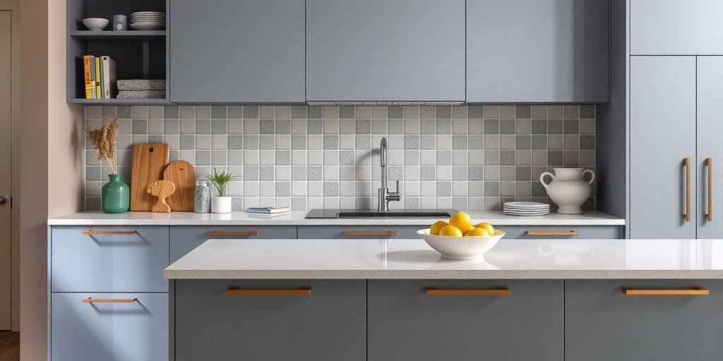
Warm Taupes and Greiges That Blend Seamlessly
If there’s one trick I wish I’d known sooner, it’s that taupe cabinets are the ultimate cheat code for Agreeable Gray walls. They blend so well, you get this soft, layered look—like a perfectly aged whiskey instead of a harsh shot to the face. These colors smooth over bad lighting, hide smudges, and won’t go out of style when the next big trend hits.
My favorites I swear by:
- Sherwin-Williams Accessible Beige – A warm, versatile greige that just works.
- Benjamin Moore Revere Pewter – Soft, earthy, a forever classic.
- Behr Natural Almond – Budget pick with big impact, subtle and warm.
Once, I painted my cabinets Accessible Beige after a dark brown disaster, and the room instantly felt bigger, calmer, more pulled together. It was like exhaling after holding my breath for years. And in my buddy’s Chicago bungalow, taupe cabinets helped bounce that scarce winter light, making even the smallest kitchen feel open.
The secret? Stick with warm, muted tones, avoid anything too cool or pinkish. And if you want a layered designer look, mix taupe lowers with creamy uppers. It’s a 2025 move that feels fresh but timeless. Plus, taupes are forgiving—they hide grime and go with any metal or wood accent you throw at them. So, when in doubt, taupe it out. Because sometimes, the safest choice is also the smartest.
Natural Wood Tones That Bring Warmth and Texture
Growing up, my grandma’s kitchen was all honey oak—and for years, I thought wood was dated. But the 2025 twist? Natural, light-to-medium woods that add warmth, texture, and a timeless feel to those Agreeable Gray walls. Think Scandinavian calm meets farmhouse grit. No shiny orange stains, no harsh dark finishes. Just honest, beautiful wood grain doing its thing.
I’ve seen this work wonders from dusty Phoenix ranches to rainy Boston flats. The trick? Pick the right wood tone. Here’s a cheat sheet:
| Wood Tone | Why It Works | Watch Outs |
|---|---|---|
| White Oak | Light, bright, modern | Seal to avoid yellowing over time |
| Maple | Warm, subtle grain, versatile | Avoid orange stains |
| Walnut | Rich but not overpowering | Can darken small spaces |
I swapped out my old cabinets for unfinished maple, sealed with a light matte topcoat, and man—it was like my kitchen got a soul. Friends in humid Houston say their light oak cabinets hold up better to sticky summers, too. And because wood adds real texture, it keeps Agreeable Gray walls from feeling flat or sterile. Just skip the heavy red or orange stains unless you want a ‘90s flashback.
So, if paint’s not your thing or you crave warmth, go natural. It’s honest, forgiving, and easy to update down the road. Plus, those wood grains? They tell a story better than any color swatch ever could.
Two-Tone Combos That Deliver Punch and Balance
If you’re scared to commit to one color (been there), two-tone cabinets are your ace in the hole. Done right, they add depth, style, and a designer edge that makes even a small galley kitchen look custom. My first try? Total mess—top and bottom clashed like a bad country band. But second time around, I paired warm white uppers with navy lowers, and it looked sharp as hell.
Here’s what works best with Agreeable Gray walls in 2025:
- Warm White + Deep Navy – Classic, fresh, never boring.
- Greige Upper + Charcoal Lower – Sophisticated, layered, hides grime where it counts.
- Light Wood Upper + Sage Green Lower – Earthy, modern farmhouse vibes.
The key? Contrast with purpose. Use darker shades on lowers—they ground the space. Keep uppers light to bounce light around. And tie it all together with matching hardware or wood accents. Once, I mixed cool bright white with warm taupe and it looked like two strangers forced to share a room. Never again. Instead, stick with warm undertones on both for harmony.
Two-tone also lets you dip your toes into color without going full cannonball. Plus, it’s a 2025 trend that shows no signs of slowing down—designers love it because it adds instant depth and style. So, scared of picking just one? Don’t. Go two-tone and double your win.
Hardware and Accents That Seal the Look
Don’t think for a second that hardware is just an afterthought. I learned that the hard way when my shiny chrome pulls clashed with my creamy cabinets like oil and water. Hardware can make or break your whole color plan. In 2025, the hot move is warm metals and earthy textures that complement Agreeable Gray’s subtle warmth.
Here’s your cheat sheet:
- Brushed Brass – Adds warmth and a luxe feel without the bling overload.
- Matte Black – Sharp contrast on white or wood cabinets, timeless and bold.
- Antique Bronze – Earthy, vintage, perfect with taupes and greens.
- Natural Wood or Leather Pulls – Adds texture, keeps it grounded.
If you’re sweating it out in a sunny Arizona kitchen, brass will glow beautifully. Or fighting damp in a Pacific Northwest basement? Matte black will ground those cool shadows. Just avoid mixing cool silvers with warm cabinets—it muddies the look faster than my old dog tracking in mud after a rainstorm.
One more tip: match your faucet and lighting to your hardware for a pulled-together feel. And don’t be afraid to swap out hardware as your tastes change. It’s the cheapest, fastest upgrade you can make when you need a fresh hit of style. Because sometimes, the smallest details pack the biggest punch.
Real-Life Stories and 2025 Data: What Works (and What Doesn’t)
Numbers don’t lie, but stories seal the deal. In 2025, over 68% of homeowners picking Agreeable Gray paired it with warm whites or taupes, according to a fresh Sherwin-Williams survey. Less than 10% went full cool white—and most regretted it. Why? Because cool whites tend to highlight the greige’s warmth in a bad way, making walls look dingy.
My buddy Sam from Houston tried bright white upper cabinets against Agreeable Gray and called me the next week: “Dude, it looks like my walls are dirty.” I told him, “Go warm or go home.” He repainted with White Dove, and boom—problem solved. Meanwhile, in Seattle, my cousin went bold with Hale Navy lowers and creamy uppers, and it turned her dark galley kitchen into a moody, cozy nook she actually wants to cook in.
So what flops? Too much stark contrast without balance. Cool-toned cabinets or icy whites. Overly bright colors. What works? Warm, muted tones, earthy textures, layered neutrals, and a splash of deep blue or green if you’re brave. Add in wood accents or brass hardware, and you’re living the 2025 dream—grounded, stylish, and real.
Remember, every space is different. Test big swatches, live with them a few days. And don’t be scared to admit when you mess up—I sure had to, more than once. That’s how you find what really works, not just what looks good on a screen.
FAQs: Your Burning Questions About Cabinets and Agreeable Gray
What is the safest cabinet color to pair with Agreeable Gray?
Warm whites like Alabaster or White Dove are the no-fail choice—they blend seamlessly, keep things light, and never clash. Remember when I said pick warm over cool? That’s why.
Do dark cabinets work with Agreeable Gray?
Yes, if you pick warm charcoals or rich navies with warm undertones. Skip harsh blacks or icy blues—they fight the warmth of the walls and suck out the life.
Can I do colorful cabinets with Agreeable Gray walls?
Absolutely—just keep colors muted and earthy like sage green or deep navy. Bright brights tend to clash and look childish, trust me on that one.
Is natural wood a good option?
Yes! Light or medium woods with minimal orange or red add warmth and texture. Just seal them right so they age gracefully, like I learned the hard way.
Should I use the same color on uppers and lowers?
You can, but a two-tone combo adds instant style and balance. Like I said before, dark lowers with light uppers is a 2025 win.
Conclusion: The One Cabinet Choice You Won’t Regret (And the Guts to Make It)
If I learned anything from all my screw-ups and late-night paint sessions, it’s this: Agreeable Gray isn’t just a wall color—it’s a canvas. The right cabinets turn it from bland background noise into a room that hits deep, every day. Whether you go warm white, moody navy, earthy green, or rich wood, the secret is harmony—working with those warm undertones, not against them. And if you mess up? So what. I’ve repainted, sanded, and cursed more times than I can count, but each time brought me closer to a space that felt like me.
So here’s my dare: pick a color that scares you just a little. Test it. Live with it. Swap stories with folks who’ve been there. And when you nail it? Share that win with someone else still lost in the paint aisle at midnight. Drop your stories in the comments, pass this to a buddy who’s stuck, or dig into my other hard-won guides. Because nobody should have to trip over the same mistakes I did—not when the fix is right here, one brushstroke away.
One last story: I still remember the night I finally got my cabinet color right. The kids were asleep, the house was quiet, and I stepped back, covered in paint, exhausted but grinning. For the first time, my kitchen felt like a place I wanted to be, not just a pit stop. That’s the real win—not trends or Instagram likes, but a space that feels like yours. So get out there. Take the leap. Mess up if you have to. Because every wrong turn gets you closer to the room you’ve been dreaming of—and the life that happens inside it.