Ever stood in your kitchen at 2 a.m., staring at those white appliances, thinking, “What the hell color cabinets won’t make this place look like a hospital break room or a grandma’s relic?” I have, more times than I care to count. I’ve painted, stripped, sanded, and cursed until sunrise—chasing that perfect mix of bright and bold that makes you wanna dance barefoot on cool tile. Because here’s the truth: the wrong cabinet color will haunt every morning coffee and midnight snack, whispering, “You screwed up.” But nail it, and suddenly your kitchen’s got swagger. I learned the hard way that choosing the right cabinet color with white appliances is like threading a needle in a hurricane—one slip, and it all unravels. I’m here to save you from my missteps and hand over the cheat codes I wish someone had tattooed on my arm years ago. We’ll crack open real colors that pop, combos that crush, and hacks that no glossy magazine will whisper. Whether your style’s sleek Seattle cool or Texas farmhouse heat, this is the down-and-dirty guide to making white appliances sing with the perfect cabinet shade. You ready? Because once you know this stuff, you won’t look at your kitchen—or yourself—the same way again.
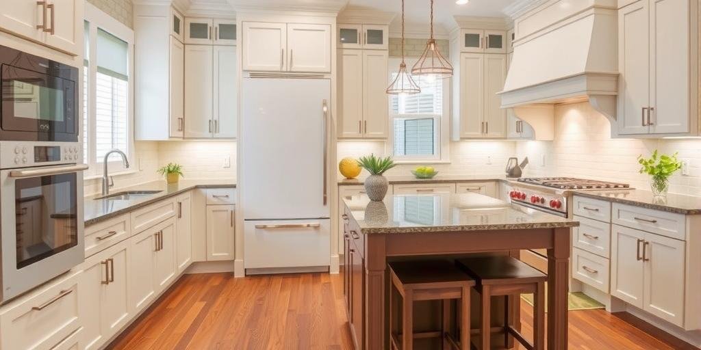
1. The Timeless Power of White-on-White: Clean, Bright, and Foolproof
I used to think white cabinets with white appliances was a cop-out, like showing up to prom in gym shorts. But the day I painted my beat-up maple cabinets white in a tiny Seattle rental, everything changed. Suddenly, that dark, damp cave turned into a crisp, light-filled oasis—even on those gray drizzle days. There’s a reason white-on-white kitchens keep trending in 2025: they reflect light, make cramped spaces look massive, and never clash. Here’s the secret: layer different shades of white—think cool Arctic white on appliances paired with creamy vanilla cabinets—to add depth so it doesn’t look sterile. Toss in natural wood shelves or a funky backsplash to break the monotony. Remember, in humid Texas summers, all that brightness fights off that sticky, heavy vibe—making it feel fresh, not heavy. The trick? Don’t match exact tones blindly. Instead, grab swatches, tape ‘em up, and watch them change morning to night. I once ignored this and ended up with cabinets yellower than a school bus. Lesson learned. Here’s a quick-hit cheat sheet:
- Cool whites + Cool whites: Modern, crisp, almost futuristic.
- Warm whites + Warm whites: Cozy, farmhouse, inviting.
- Cool appliances + Warm cabinets: Can clash—test carefully.
Pros and cons? Check this:
| Pros | Cons |
|---|---|
| Bright, bigger feel | Can look bland if flat |
| Easy resale appeal | Needs regular cleaning |
| Timeless style | Risk of sterile vibe |
So, what’s the one thing you’re scared to screw up? For me, it was creating a space so boring I’d hate it. But with layered whites and a punchy rug or funky hardware, you get clean without cold. And that’s a win you’ll feel every morning.
2. Bold Blues: From Moody Navy to Breezy Sky, the 2025 Game-Changer
If you want a kitchen that punches you awake every morning, blue cabinets with white appliances are where it’s at. I first tried navy after a wild night of inspiration—and okay, a little too much tequila—and woke up thinking I’d gone too far. But once the sun hit those deep blues, paired with my old white fridge, I swear it looked like a magazine spread. Navy or midnight blue brings drama without swallowing the room, especially if you’re somewhere like Seattle where every beam of light counts. Or go sky blue in a Texas ranch house to cool down those blazing summers. What nobody tells you? It hides grime way better than white, so you can slack a bit without your kitchen ratting you out. The latest 2025 stats show deep blues are the fastest-growing cabinet trend, up 15% since 2023—people want color but still crave calm. Here’s my quick cheat sheet:
- Navy + white appliances: Modern, sharp, gutsy.
- Sky blue + white appliances: Airy, beachy, laid-back.
- Teal or cobalt: Funky, energetic, a little daring.
Here’s a napkin-worthy pros and cons:
| Pros | Cons |
|---|---|
| Hides messes | Can feel dark without good lighting |
| Adds personality | Not everyone’s resale cup of tea |
| Pairs well with gold/black hardware | Can clash with warm undertones |
One mistake? I rushed navy without testing—ended up looking almost black on cloudy days. So always sample first. Remember, this combo’s like herding cats in a thunderstorm if you wing it. But get it right, and your kitchen’s got soul that wakes you up better than any coffee.
3. Earthy Greens: Bringing Calm, Nature, and a Fresh Start
After a brutal year, I craved something that felt alive, so I slapped a sage green on my cabinets, paired with my stubbornly white appliances. Instantly, the kitchen felt calmer, like a breath of mountain air during a sweaty Texas heatwave. In 2025, earthy greens—from soft sage to deep olive—are exploding, up 20% because folks want that nature-inspired peace. This isn’t your grandma’s avocado fridge—this is organic, soothing, and surprisingly versatile. Best part? It makes white appliances feel intentional, not outdated. Here’s what I picked up:
- Sage green: Subtle, calming, timeless.
- Olive or moss: Rich, cozy, grounded.
- Mint: Playful, fresh, perfect for small spaces.
Pros and cons I learned the hard way:
| Pros | Cons |
|---|---|
| Soothing vibe | Can feel drab if underlit |
| Pairs well with woods and brass | Clashes with some bright backsplashes |
| Great for resale | Requires careful undertone matching |
Secret tip? Use a semi-gloss finish to bounce light and avoid the muddy look I once got in my dark apartment. This green + white combo is like that first cool breeze off the porch after a sweltering day—refreshing, real, and needed. What’s keeping you from trying it? Fear of it looking old-fashioned? Trust me, these new earthy tones are pure gold.
4. Rustic Wood Tones: Warmth Meets White for That Hug-You-Back Feel
Sometimes you just want your kitchen to feel like a warm hug after a long, bruising day. That’s what natural wood cabinets with white appliances gave me in my old fixer-upper. Against all odds, that warmth made my cheap white stove look intentional, almost designer. Why? Because in 2025, organic, rustic vibes are everywhere—from Texas ranches to Seattle lofts. The wood’s grain adds texture, hiding inevitable scuffs and splatters. But pick your stain wisely. Too orange or too red, and it screams 90s nightmare. Aim for:
- Light oak or ash: Brightens, keeps it casual.
- Walnut or chestnut: Deep, rich, classic.
- Reclaimed or distressed: Adds soul, hides wear.
My screw-up? I once slapped a dark cherry stain on, thinking it’d look fancy—instead, it clashed so bad with my white fridge I wanted to rip the doors off. Lesson: test stains on scrap first. Here’s the pros and cons table I wish I had:
| Pros | Cons |
|---|---|
| Warm, inviting | Wrong stain can clash |
| Timeless appeal | Needs sealing to prevent stains |
| Great with farmhouse or modern looks | Prone to scratches |
Want that cozy, lived-in feel? Rustic wood’s your ticket. But don’t rush it—because nothing’s worse than mismatched tones staring back at you every morning like a bad decision you can’t unsee. What’s your mess? Maybe it’s too much orange or too little warmth. Either way, wood plus white just feels right—like home.
5. Dramatic Charcoal and Black: Edgy Contrast for the Brave
One day, fed up with boring, I rolled on the blackest paint I could find, daring my white appliances to clash—and damn, they didn’t. Instead, they popped so hard it looked straight out of a design mag. In 2025, charcoal and black cabinets with white appliances are the rebel move that more folks are risking—and winning. The high contrast is bold, modern, and a little rebellious. It hides grime better than any pastel, perfect if you’re wrestling Texas dust or Seattle mud. But it’s tricky: too much black swallows light and shrinks the room, so balance with bright walls, shiny hardware, and good lighting. Here’s my quickie cheat sheet:
- Matte black: Sleek, gritty, hides fingerprints.
- Charcoal gray: Softer, versatile, a safe step.
- Gloss black: Reflective, dramatic, needs more upkeep.
Pros and cons I learned by trial and error:
| Pros | Cons |
|---|---|
| Bold statement | Can make rooms feel small |
| Hides dirt and wear | Needs good lighting |
| Modern, luxe feel | Shows dust on glossy finishes |
My secret stash tip? Go black on the lowers, white or light up top—best of both worlds. What’s the one thing you’re scared to screw up? Probably making it too dark. But get the balance right, and it’s like flipping the bird to boring kitchens everywhere. Pure fire.
6. Soft Grays: The 2025 Cool-Down That’s Classy, Not Cold
After one too many color disasters, I found peace in the middle—gray cabinets with white appliances—and man, it saved my sanity. It’s like that perfect Seattle day: cool but bright, calm but alive. In 2025, soft grays are climbing fast because they’re safe without being boring, modern without feeling trendy. Light grays bounce light, making even tiny galley kitchens feel open, while darker grays add just enough mood. Here’s my go-to list:
- Light dove gray: Airy, clean, versatile.
- Greige: Warm, cozy, flexible.
- Slate or storm gray: Rich, sophisticated.
Pros and cons I picked up the hard way:
| Pros | Cons |
|---|---|
| Easy to pair with accents | Can look dull if flat finish |
| Hides smudges well | Undertones tricky to match |
| Neutral for resale | Less bold than other options |
Secret? Use two-tone grays to add depth—like a lighter gray on uppers and darker on lowers. And always test in real light. I once chose a gray that looked perfect on the swatch but turned blue under my LED bulbs—ouch. This gray + white combo is like that cool friend who never tries too hard but always looks sharp. Try it—I dare you.
7. Pops of Color: Yellow, Coral, and Other Brave Moves
Sometimes you just need to say, “Screw it,” and splash on a color that makes you smile. I once went wild with a mustard yellow—half my friends thought I was nuts, but every morning felt like sunshine, even through Seattle drizzle. In 2025, bold pops like yellow, coral, or even blush pink are creeping into kitchens, paired with white appliances for a playful, punchy look. Here are some quick hits:
- Mustard yellow: Warm, happy, retro-cool.
- Coral: Energetic, young, beachy.
- Blush pink: Soft, trendy, surprisingly chic.
Pros and cons from my own circus:
| Pros | Cons |
|---|---|
| Unique personality | Harder resale |
| Brightens space | Easy to overdo |
| Pairs well with white appliances | May clash with other colors |
One trick? Use these colors on just an island or lower cabinets to keep it fun, not frantic. Mess this up, and it’s chaos—like herding cats in a thunderstorm. But get it right, and every day feels like a fresh start. What bold move are you dying to try? Maybe now’s the time to go for it.
8. Modern Two-Tone Magic: Break the Mold with Style That Sticks
One day, after a few paint disasters, I realized—why pick just one? Enter the two-tone cabinet trend that’s blowing up in 2025, up nearly 18% according to fresh reports. I tried it with dark lowers and white uppers, and suddenly my cramped Texas kitchen felt twice as big and twice as cool. It’s like cheating the system—get drama and light, warmth and cool, all at once. Here are some killer combos:
- Navy lowers + white uppers: Bold yet bright.
- Charcoal lowers + wood uppers: Modern with texture.
- Green lowers + cream uppers: Calm, earthy, fresh.
Pros and cons, from my own wins and flops:
| Pros | Cons |
|---|---|
| Adds depth and interest | Requires precise color picking |
| Balances drama and light | Can look busy if overdone |
| Feels custom and modern | Harder to match decor |
Secret stash tip? Use the darker shade on bottom to ground the space, lighter up top to open it up. Mess this up, and it’s visual chaos. But nail it, and it’s like flipping the kitchen design rulebook on its head—in the best way. What’s your bold mix? Maybe now’s the time to find out.
9. Metallic Accents and Hardware: The Secret Sauce That Ties It Together
Here’s what nobody tells you: hardware and tiny accents can make or break your cabinet + white appliance combo. I once cheaped out on dull silver pulls, and my fresh paint job looked flat. But swap in matte black or warm brass, and suddenly, boom—it looked designer. In 2025, mixing metals is finally cool—think brass with stainless, or black with nickel. Here’s my quick cheat chart:
- Brass + warm cabinet colors: Cozy, luxe.
- Black + bold blues or grays: Modern, edgy.
- Nickel + whites: Classic, clean.
Pros and cons I lived with:
| Pros | Cons |
|---|---|
| Cheap upgrade with big impact | Wrong mix can clash badly |
| Easy to swap out | Trendy metals may date fast |
| Pulls a look together | Quality varies—watch finishes |
Little swap, huge payoff—like adding hot sauce to bland chili. What are you scared to mess up? Maybe it’s picking the wrong metal—but trust me, test a few, and it’s the fastest way to make that appliance/cabinet combo sing. Don’t skip it.
10. Lighting and Flooring: The Undercover Heroes of Your Color Choice
Here’s the dirty secret no one tells you—lighting and flooring matter just as much as cabinet color. I once painted my cabinets the perfect blue, but under sad yellow bulbs, it looked sickly. Change the bulbs to cool LEDs—bam, magazine-worthy. And don’t get me started on floors. In a sweaty Texas kitchen, light tile kept things bright and cool. In rainy Seattle, dark wood hid mud and felt cozy. Here’s my cheat sheet:
- Warm flooring + cool cabinets: Balanced vibe.
- Cool lighting + warm cabinets: Can clash—test first.
- Natural light: Always your best friend.
Pros and cons to weigh:
| Pros | Cons |
|---|---|
| Right light enhances color | Wrong light ruins it |
| Flooring ties look together | Bad floors clash badly |
| Both are upgrade points | Can be costly to change |
Secret stash moment? Before painting, test swatches in all light and next to your floors. Saves you from waking up to a nightmare. What’s the one thing you’re scared to screw up? Probably everything. But get the light and floors right, and suddenly, every color looks better. Trust me, it’s worth the grind.
FAQ: Your Burning Questions About Cabinet Colors and White Appliances
Q1: Will white cabinets with white appliances look too plain?
Remember when I said layering whites adds depth? That’s the key. Mix cool and warm tones, add wood or metal accents, and it’ll look fresh, not flat. It’s timeless, but never boring if you do it right.
Q2: Are bold colors like navy or green good for resale?
Surprisingly, yes. 2025 reports show buyers crave personality but not chaos. Stick to muted, earthy shades or deep blues—they read modern and inviting, not risky.
Q3: Can I mix hardware finishes?
Absolutely. Like I said, mix brass with black or nickel for that layered designer vibe. Just keep undertones similar to avoid a clash.
Q4: How do I avoid my kitchen feeling too dark with bold cabinet colors?
Balance is everything. Use lighter uppers, reflective finishes, or boost lighting. Like I found, a little planning keeps bold colors from taking over.
Q5: What’s the fastest upgrade if I can’t paint right now?
Swap hardware, add a bright rug, or change lighting. Like I said earlier, these small tweaks can transform the look without the mess of paint.
Conclusion: The No-BS Truth About Cabinet Colors with White Appliances
Look, I’ve screwed this up more times than I can count—wrong colors, rushed jobs, lighting nightmares. But every mistake sharpened my eye and toughened my gut. The biggest lesson? There’s no one-size-fits-all answer. It’s about what feels like home to you. Whether you crave the clean punch of white-on-white, the bold thrill of navy, the earthy calm of sage, or the rebel yell of black, make it real. Layer your whites, test your colors in real light, and don’t forget those secret weapons—hardware, floors, and lighting. Because that’s the real kitchen magic. Here’s my dare: pick one trick from above, just one, and try it this weekend. Swap those pulls. Test that paint. Change that bulb. Small wins add up. And if you’re scared? Good. That means it matters. Spill your guts in the comments, share your mess or your wins—I wanna hear ‘em. Because this isn’t just about cabinets and appliances. It’s about carving out a space that fires you up every damn day. One that feels like you fought for it—and won. So go on, tear into it. And if you need more of my battle stories, stick around. We’ve got a lot more kitchen wars to win together.