Ever ripped open a paint can at midnight, praying it matches that cabinet door you’ve stared at for weeks, only to find out it’s as off as a Texas summer rainstorm? Yeah, me too. I’ve stood in the fluorescent hell of hardware stores, sweating like I’m back in a sticky New Orleans July, clutching color swatches while wondering, “How the hell do you actually nail this?” Because matching kitchen cabinets isn’t just about color—it’s about stitching together your past, your busted-up dreams, and that wild hope of a space where family fights, laughter, and late-night snacks all belong. I’ve fumbled through clashy wood grains, splurged on trendy hardware that looked dated in six months, and nearly torched my patience trying to line up doors that just wouldn’t sit right. But every mistake handed me a lesson so sharp I still wince—and now? I’ve gathered the hard-won tricks people pay designers thousands for, plus fresh 2025 insights no glossy mag will tell you. This isn’t about cookie-cutter kitchens or showroom perfection. It’s about your messy, beautiful, real-life space, and how a few dead-simple moves can turn it from chaos to comfort. Stick around—I’m about to hand you my cheat sheet, the stuff I wish someone whispered in my ear before I wasted time, cash, and sanity. Because when it clicks—when your cabinets sing in sync? It’s like catching that perfect sunset in Seattle after weeks of drizzle. And you’re gonna want that feeling every damn day.
1. Start with Your Kitchen’s Soul: Finding Your True Style
Before you slap on paint or swap out knobs, dig deep: What story does your kitchen want to tell? I learned the hard way that chasing trends without heart leaves a room colder than a Midwest winter. Back when I chased that all-white, Pinterest-perfect look, it felt sterile, like a rental I never wanted. But when I leaned into my “beat-up barn” vibe—mixing warm woods with hammered hardware—it finally felt like home. So, ask yourself:
- Are you craving cozy farmhouse grit or sleek, modern lines?
- Do vintage pulls make you smile or do you want minimalist stealth?
- What colors spark joy—not just now, but on those bleary Monday mornings?
According to a fresh 2025 Houzz survey, over 63% of homeowners regret ignoring their gut and chasing fleeting fads. Don’t be that person. Instead, build a mood board that’s less about magazine shots and more about your life—favorite mugs, grandma’s bread bowl, paint chips from your first apartment. This is your kitchen’s heartbeat. Here’s a quick table I scribbled last time I was stuck:
| Style | Key Features | Pros | Cons |
|---|---|---|---|
| Farmhouse | Warm woods, open shelving, vintage pulls | Inviting, timeless | Can feel cluttered if overdone |
| Modern | Flat panels, muted tones, sleek hardware | Clean, spacious look | May lack warmth |
| Transitional | Mix of classic and new; simple lines | Flexible, balanced | Risk of looking bland if not personalized |
So, what’s your kitchen’s soul whispering? Don’t rush this. Because everything else hangs on this truth. Get it wrong, and you’re herding cats in a thunderstorm. Get it right, and everything else falls into place. Your move.
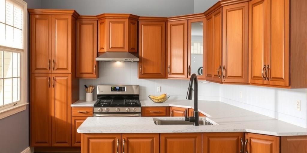
2. Nail the Color Harmony: The Art (and Science) of Shades
Confession time: I once painted upper cabinets in “Snow Drift” and lowers in “Bone White,” thinking it’d be subtle. Instead, it looked like I ran out of paint halfway. Color matching is a tightrope walk between contrast and chaos. The 2025 National Kitchen Trends report shows that two-tone kitchens are hotter than ever, but 58% of DIYers mess up the balance—either too bland or too circus. Here’s the trick I learned after that flop:
- Pick one dominant color that anchors the space—usually the lowers or large pantry units.
- Complement with a lighter or darker shade for the uppers or island.
- Use a color wheel to find hues that play nice—opposites add pop, neighbors add calm.
In humid places like Miami, I’ve seen bright whites turn dingy fast, while dusty blues stay crisp. Meanwhile, in a foggy Seattle basement, warm cream keeps things from feeling like a cave. The key? Test big swatches on the actual cabinets under your kitchen lights, day and night. Because what sings in the store might croak in your home. I swear by this cheat sheet:
| Base Color | Good Matches | Risky Pairings |
|---|---|---|
| Warm White | Soft gray, sage green, natural wood | Stark black, neon brights |
| Deep Blue | Brass hardware, light oak, cream | Bright red, cool pinks |
| Charcoal Gray | Matte black, walnut, muted gold | Bright orange, pastel yellow |
So, what’s your gut say? Stop overthinking—grab those samples, slap ‘em on, and trust your eyes. Because the right color mix? It’s like the perfect playlist—smooth, surprising, and totally you.
3. Get Your Materials Straight: Mixing Woods, Metals, and Finishes
Ever seen a kitchen that’s like a thrift store exploded—shiny chrome next to rusty bronze, fake oak fighting real walnut? Been there, bought the bargain pulls, and cursed every time I looked. The 2025 Remodeling Index shows that kitchens with cohesive material palettes sell 40% faster. Why? Because our eyes crave harmony. Here’s my no-sweat fix:
- Pick one dominant wood tone—maple warmth or walnut richness—and let it lead.
- Mix metals only if one is subtle—say, matte black hinges with brass pulls.
- Keep finishes in the same family—satin with satin, matte with matte.
Down in Austin, the heat had me sweating over sticky lacquer that never cured right. Lesson learned: in humid or hot zones, go for durable, water-resistant finishes that won’t peel or warp. And always test metal combos before you commit. Here’s a table I sketch out for friends:
| Material | Best Match | Watch Out For |
|---|---|---|
| Light Oak | Matte black, sage green paint | Polished chrome (clashes) |
| Walnut | Brass, cream paint | Bright nickel (fights warmth) |
| Cherry | Oil-rubbed bronze, muted whites | Silver chrome (too cold) |
Matching materials is like pairing boots with jeans: get the vibe right, and you look sharp; mismatch, and it’s a mess. What’s your material mismatch nightmare—and how will you fix it?
4. Cabinet Styles That Play Nice: From Shaker to Slab
I once slapped slab doors on old-school paneled cabinets thinking I’d “modern it up.” Instead, it looked like a bad patch job from a Craigslist handyman. Style clashes are brutal. According to the 2025 NKBA survey, Shaker remains the top pick, but flat panels are gaining. Here’s what I learned:
- Keep style consistent across main cabinets. Mixing raised panels with slabs rarely works.
- Use style changes only for islands or accent pieces—like beadboard on a coffee nook.
- Match style to home architecture—a Tudor home with ultra-modern cabinets feels off.
In a Boston brownstone, those classic Shakers fit like a glove. But in a SoCal ranch? Flat panels shine. Here’s a quick guide:
| Cabinet Style | Best For | Pros | Cons |
|---|---|---|---|
| Shaker | Traditional, farmhouse, transitional | Timeless, flexible | Overused if not personalized |
| Flat Slab | Modern, minimalist | Sleek, easy clean | Can feel cold |
| Inset Panel | Classic, upscale kitchens | Elegant, custom look | Pricey, tricky install |
Don’t Frankenstein styles. Pick one that fits your home—and you. Because mixing styles? It’s like wearing cowboy boots with a tux. Someone will notice, and not in a good way.
5. Hardware that Hooks It All Together
Hardware’s tiny, but it’s the handshake of your kitchen. I once blew $300 on slick chrome pulls, only to realize they looked like bad costume jewelry on my rustic cabinets. The 2025 hardware trend? Matte black and aged brass are kings, but mixing finishes is hot—as long as you do it right. Here’s what saved me:
- Match hardware tones to your faucet and lighting for cohesion.
- Pick shapes that echo your cabinet style—square pulls with Shaker, sleek bars for slab.
- Test samples on doors before the full commit. Lighting changes everything.
In muggy Atlanta, I learned that polished brass tarnishes fast. So, opt for finishes that suit your climate and cleaning routine. My quick cheat sheet:
| Cabinet Style | Hardware Shape | Finish Match |
|---|---|---|
| Shaker | Square or cup pulls | Matte black, aged bronze |
| Flat Slab | Sleek bars or finger pulls | Brushed nickel, matte black |
| Inset Panel | Traditional knobs | Oil-rubbed bronze, antique brass |
This tiny detail packs a punch. Get it wrong, and it’s like wearing flip-flops with a suit. So, what’s your hardware horror story—or the fix you swear by?
6. The Countertop Connection: Marrying Cabinets and Surfaces
I once paired creamy cabinets with a busy granite slab. Looked like a vanilla sundae splattered with mud. Countertops can clash or sing. The 2025 data? Quartz rules at 72% of new installs, with subtle veining beating wild patterns. Here’s my no-BS fix:
- If cabinets are bold, go subtle on the countertop.
- For plain cabinets, a dramatic slab adds life.
- Always grab large samples and check them under your kitchen’s real light.
In dry Arizona kitchens, bright whites keep things cool. Up north in damp Portland, warmer tones cozy up gray skies. Here’s a quick table:
| Cabinet Color | Countertop Type | Good Matches |
|---|---|---|
| Light Wood | Quartz, butcher block | Soft cream, light veining |
| Dark Blue/Gray | Marble-look quartz | Subtle white, soft gold veining |
| White | Granite, quartz | Warm or cool tones, but low pattern |
Matching here is like a first date outfit—too busy and it screams desperation, too plain and it’s forgettable. Find that sweet spot, and your kitchen will hum.
7. Lighting: The Make-or-Break Magic Wand
Once, I installed warm bulbs on one side and cool LEDs on the other. Looked like a bad Instagram filter. The 2025 lighting gospel? Layer it up: task, ambient, and accent lights. Here’s what I learned in my sweaty Houston summer reno:
- Use warm lighting (2700K-3000K) to cozy up cool cabinets.
- Bright daylight bulbs (4000K+) wake up dark kitchens but can feel stark if overdone.
- Mix recessed cans, under-cabinet strips, and a bold pendant or two.
Lighting shifts everything. That sage green I loved? Turned sickly under the wrong bulb. So, always test paint under your kitchen’s real lights. Here’s a cheat sheet:
| Cabinet Tone | Best Lighting Temperature | Effect |
|---|---|---|
| Warm woods | 2700K | Cozy, inviting |
| Cool grays/blues | 3000-3500K | Bright but soft |
| Pure whites | 3500K+ | Clean, crisp |
Lighting’s the secret sauce. Mess it up, and even perfect cabinets look off. So, what’s your lighting mess—and how will you fix it?
8. Flooring: The Foundation of Your Cabinet Story
I once stuck sleek white cabinets over orangey oak floors. Looked like a bad spray tan. Flooring can make or break your cabinet match. The 2025 trend? Lighter, natural-tone woods and stone-look tiles. Here’s what’s saved my bacon:
- Keep wood undertones consistent—warm with warm, cool with cool.
- Use contrast wisely—light floors with dark cabinets for drama, or similar tones for calm.
- Patterned tiles? Keep cabinets simple to avoid overload.
In snowy Vermont, darker floors hide mud but make tiny kitchens feel tight. In sunny LA, pale floors bounce light and open space. Here’s a quickie:
| Cabinet Color | Floor Type | Good Picks |
|---|---|---|
| Warm White | Natural oak, maple | Light or medium wood |
| Dark Gray | Stone tile, light ash | Light contrast floors |
| Blue/Green | Neutral wood, concrete | Soft gray or natural beige |
Flooring’s the backdrop. Get it wrong, and it’s like a bad haircut—you can’t stop seeing it. So, what vibe do you want underfoot?
9. Small Details, Big Impact: Crown Molding, Panels, and Glass
I once skipped crown molding to save cash. The cabinets looked chopped off—like bad bangs. The 2025 insight? Personal touches like glass doors, trim, or paneling make kitchens unforgettable. Here’s my cheat sheet:
- Add crown molding for a finished, taller look.
- Swap some solids for glass fronts to break monotony.
- Use end panels to hide raw edges and add polish.
In damp Seattle, glass fronts fogged up easy, so consider climate and maintenance. Here’s your quick guide:
| Detail | Effect | Best With |
|---|---|---|
| Crown Molding | Taller, refined feel | Traditional, transitional |
| Glass Doors | Lightens look, shows off dishes | Farmhouse, modern |
| End Panels | Custom, finished touch | All styles |
Small tweaks, big wow. Skip them, and it’s like forgetting the last button on your shirt. What detail will you dare to add?
10. Trust Your Gut—and Break the Rules
Truth? I’ve read all the guides, watched the shows, and sometimes the best kitchens break every “rule.” The 2025 design rebels? Mixing woods, bold colors, wild lighting—and it works because it’s theirs. Here’s what I learned:
- Test crazy combos on a small scale first—a painted island, mixed hardware on drawers only.
- Trust your gut over trends—if neon pink makes you grin, damn the haters.
- Live with samples for a week. If you still smile, go all in.
In sweaty Florida, I saw a neighbor’s mint green and mango-orange kitchen—and it worked, because it was pure her. So, what’s that one “wrong” thing you secretly love? Maybe it’s time to unleash it. Because matching cabinets isn’t about perfection—it’s about building a space that feels like you, bruises and all.
FAQ: Your Burning Kitchen Cabinet Questions
How do I pick matching colors for cabinets?
Remember when I said trust big samples and your kitchen’s real light? That’s key. Pick a dominant color, then complement with a lighter or darker shade. Use a color wheel to check harmony. And always test in your space, not just the store.
Can I mix cabinet styles?
Mixing can work only if it’s purposeful—like a different island style—but main cabinets should stay consistent. Like I shared, Frankenstein jobs usually flop. Keep it simple, then add accents if you want flair.
What finish is best for humid climates?
In sticky spots like Houston, durable water-resistant finishes like polyurethane or marine-grade paints last longest. Satin or semi-gloss resists moisture better than matte, which can peel.
How do I match cabinets with old floors?
Check the undertones—warm with warm, cool with cool. If contrast is too harsh, add a rug or transition piece to blend the gap. Like I learned, flooring’s the backdrop, so work with what you’ve got creatively.
Is two-tone cabinet design still trendy in 2025?
Big yes. Fresh reports show it’s going strong, especially when balanced right. Just avoid harsh contrasts and test combos under real light, like I warned. It’s about balance, not shock.
Conclusion: Your Kitchen, Your Story—No Regrets
I’ve been the guy cussing at peeling paint in a muggy Texas August and the one smiling at a color combo nobody else would dare. I’ve wasted cash and sanity, but every mistake turned into a lesson I’d tattoo on my arm if I could. Matching kitchen cabinets isn’t about perfect paint chips or Instagram likes. It’s about building your own patchwork of life, love, and messy breakfasts. When you trust your gut, break a few rules, and fix what’s fixable, that kitchen becomes your heartbeat. So, what’s stopping you? Grab those samples. Test those wild ideas. Spill your guts in the comments, share your wins and wipeouts, and hell, pass this along to someone stuck in the same mess. Because this isn’t just cabinets—it’s your corner of the world, stitched together one stubborn, beautiful choice at a time.
Picture this: It’s late, you’re barefoot on cool tiles, sipping coffee in a kitchen that finally feels like yours. The colors glow just right. The hardware fits like an old glove. And every scratch, every mismatched bit? It’s part of your story—real, raw, and better than any showroom. That’s what I want for you. Because I’ve been there—lost, broke, covered in paint—but I found my way. And so will you. Your kitchen’s waiting. Now get out there and make it yours.